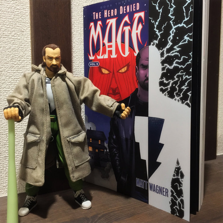
Reviews are weird things: on one hand, there is a certain amount of objectivity which most people expect. Sure, reviewing a piece of technology gives a little more leeway in this respect than a work of art, but still – presenting the quality of the subject in an even handed manner is important. But, reviews are also expected to present a point-of-view – after all, why bother with a review if you are not interested in what the writer thought about the subject? I recently got ahold of the first TPB of Mage: The Hero Denied by Matt Wagner. Here’s my one-sentence review: it was fucking fantastic. I am impatently awaiting the next and final volume. Given that the Mage trilogy began in the mid-eighties, I, along with other fans, have been impatently waiting for over thirty years.
My grade for Mage: The Hero Denied #1: B+
So, as is the tradition, I decided to see what others thought of the first half. I had been avoiding reviews since the first floppy was released, which wasn’t difficult given Mage’s realatively niche appeal. One of the reviews I stumbled upon (which only covered the first issue) was on the A.V. Club (link to the Google cache version) and it was… words? It’s not the fact that it was negative – you’re free to dislike whatever you want – but more that most the criticisms were at best tangental, and at worst, completely non-sensical.
Let’s get the positives out of the way: the reviewer, Caitlin Rosberg, does have some legitimate criticisms of the first issue, including Kevin’s lack of character development over the years, the seeming seeming sidelining of Kevin’s wife and daughter in favour of Kevin (a writer favouring the protagonist – well I never!) and his son, and the depiction of the Umbra Sprite and the Grackleflints, who are now female, the Umbra Mother and Gracklethorns respectively. Now, I feel that all her points are on shakey ground at best, but they at least deal with the subject of the review and give some supporting arguments as to why Rosberg feels that way. But it’s those last two points where she starts to go off the rails.
First, Rosberg complains that Magda, Kevin’s wife, is reduced to doing the laundry and “nagging” (her quotes, not mine) him, despite being a powerful witch. So, yes – she is doing the laundry. Sometimes people need to the the laundry. And sometimes those people happen to be married and a woman. The implication is that this lessens her character somehow. Further, it is really a stretch – a yoga-like, spine breaking stretch – to say she’s nagging Kevin. As it’s written, it sounds like normal, married people conversation. Kevin isn’t drawn or written as if he’s annoyed or downtrodden, nor does Magda give any indication she’s browbeating him.
The second main complaint is:
These new lady Gracklethorns not only have revealing outfits instead of matching suits, they have tiny waists, styled hair, eyes to host their long lashes, and carefully defined lips. But their faces convey no emotion at all. Their progenitor, the Umbra Sprite, is now the Umbra-Mother, similarly svelte and with her butt-crack improbably showing through her pencil skirt. The overall impression is that in order to be female, they must be drawn and speak as sexual objects, and it’s clear Wagner’s writing has not evolved at all since he fridged Edsel 30 years ago.
There is a lot to unpack here, but the main point is that Rosberg quickly decided to leave reviewing the book behind and start ranting about her views on the representation of women in comics (or at least a comic). Nevermind that the Grackleflints have always embraced one stereotype or another, so conforming to a generic hot woman appearance isn’t something to lose your shit over. Although I do believe she has a point, at least from a long-time reader’s perspective: traditionally, the Gracs have always been very clone-ish, so the Gracklethorns are breaking from tradition by having more unique appearances. Not a particularly strong point, but small victories. The latter part is where things get weird: Edsel was not fridged. She sacrificed herself to save Kevin (so did Sean before her). I pulled out my copy of The Hero Discovered to make sure my memory wasn’t playing tricks on me. She was not fridged, but that completely false narrative fits much nicer into Rosberg’s outrage / dismissal of Wagner’s writing. But the weirdest, least relevent stuff is yet to come.
Completionists may buy the books, but there’s far too much competition for Wagner to get away with serving up something so stale. There are other, better comics about predestined heroes, and many of them have women, people of color, and LGBTQ+ characters in them with agency and their own stories tell.
What. The. Fuck. This is known in psychological circles as going bat-shit insane. This last paragraph has nothing to do with the subject at hand and everything to do with Rosberg’s politics. If you want to read stories where the protagonist is not a white guy: more power to you. Go for it. Read Monstress. Paper Girls. The Wicked + The Divine. Even the bastion of white guy protagonists (DC and Marvel) are publishing more and more material where your superhero is not a re-skinned Clark Kent, Bruce Wayne, or Peter Parker. But to go write a review of a very long running series where the protagonist is known to be a straight, pale-skinned male and then use that as a strike against it is ridiculous.
My grade for the AV Club’s review of Mage: The Hero Denied #1: D (maybe a D+ if I’m feeling generous)
Today is November eleventh, Pocky Day in Japan. Which is fine. I guess. I like Pocky. But a far more important day occurred a few days ago on the eighth: Nice Boobs Day (いいおっぱいの日)!
Japanese trivia of the day
Why is it Nice Boobs Day, you may be asking? It’s based on a pun – as all good holidays are. So: writing November eleventh as 11/08 gives us the start of the convoluted wordplay, in Japanese that is. Visually, 11 looks like 「いい」, or “ii” – that is, “good” in English.
Next up, 0 looks like “o”, which has the same pronunciation as the character 「お」. So we’re up to the Old MacDonald-ish “ii o.”
Finally, 8. Japanese has a bunch of different ways to pronounce numbers which is far too complex (i.e. needlessly annoying) to go into here. The basic way is “hachi”, written as 「はち」 in hiragana. The first character, “ha” (は), can be pronunced like “pa” if you add a maru (ぱ). Personally, I think this where things start to get stretched a little thin, but I’m not a native speaker, so what do I know. Anyway, we now have “ii opa”. A couple of further small tweaks and we end up with “ii oppai”, or, “nice boobs.” Hopefully, this bit of knowledge will come in useful. I can’t imagine how, but now you know.
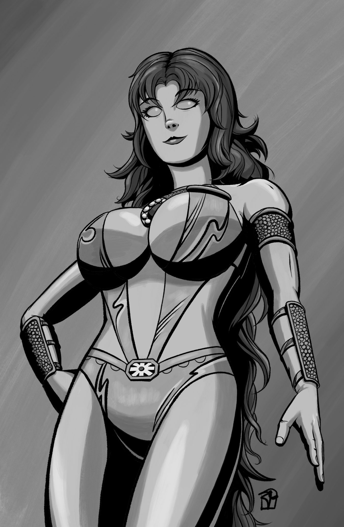
Anyway, I did a quick drawing of DC’s Starfire to celebrate this most holy of days. I know the kids are all about the version from that (mediocre) early 2000s Teen Titans cartoon, but since I grew with the series by George Perez and Marv Wolfman, this version is the real Starfire for me. Although I did tone down the giant hair a little.
I posted this to my Instagram on Nice Boobs Day, so it’s a little late to be posting here, but Nice Boobs are too important to be contained to a single day. Or contained by straining fabric.
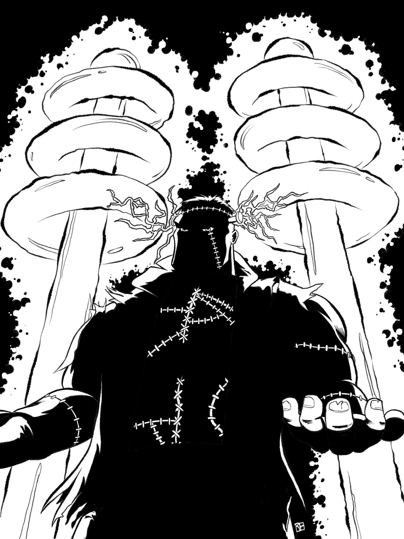
It was almost Halloween, so Frankenstein’s monster seemed like a solid subject. I’m really satisfied with the way this one turned out, although at the time, I regretted going in on the Kirby dots, because that is some time consuming work.
A final thought
Something which I forget is that “Inktober is a month long art challenge”, with the emphasis on that last word: challenge. And frankly, after week three, it was a challenge that I wasn’t sure I was going to complete. But I did manage to complete it, and on a fairly positive note, which was nice. But it was challenging. Between the day job and life in general, time is always tight. Plus, given my relatively slow pace when working, it was a real challenge to find the time. But find the time I did, and the experience of doing Inktober, even if it was the half marathon, is something which I think has made me a better artist, but not completely in the way I expected.
“When you have to shoot, shoot. Don’t talk.”
Far more intelligent people than me have said it, but time is one of the most important parts of creativity – time to practice, time to produce, time to fail, time to try again, time to recharge your creative batteries, time, time, time. But time, unless you have access to a time machine or the Speed Force™, is a zero-sum game. When I’m not working on a commission or design project, I have a bad habit of wanting to just relax. And don’t get me wrong – it’s not that I don’t love making art, but, frankly, certain parts of life really sap my energy and so after a tough day or week, I generally feel like I don’t have anything left to spend on creative endevours. And make no mistake: being creative is fulfilling, but it is taxing. I’m sure there’s some neuroscience out there to back this up. And if there isn’t, there should be damn it. Anyway, this was my big revelation:
Tough shit, soldier.
This is not a profound thought. When you have to work, you work – simple. But like many simple things, simple does not mean easy. So Inktober was a reinforcement of this principle for me. And sure, I think some of my technical skills improved (incrementally), but the real benefit of Inktober was reminding me that yes, I do have the energy reserves, time management skills, and self-discipline to produce art even with the rest of life happening.
The blog Dear Art Director has a fantasic article about being creative when you have low energy, which I initially read a few years ago, but I obviously never absorbed until now, so thanks, Inktober!
Next year?
If you asked me right now, “Hey, Rob – are you going to do Inktober 2019?”, I’d say, “How did you get in my apartment?” But after we established you had no nefarious purposes, I’d say, “No.”
I’m glad I did it, but right now, I’m burnt out on Inktober. Of course, it just finished a few days ago, so I may very well change my mind. If I do decide to do 2019, I might be a little less strict on the prompts, or even ignore them altogether: a drew a blank on a few of the prompts, and those were the days which were the most stressful. And one of my goals, to push my drawing beyond my usual fare (i.e. comic book / fantasy / sci-fi stuff), is something that never materialized, so it would be good to move in that direction.
So, I’m not doing Inktober next year. Maybe. Or I might. I dunno. I’ve got about eleven months to decide, and it’s dinner time now, so I’ll deal with it much later.
After the disaster that was week three, my enthusiasm for Inktober was, at best, at the bottom of a deep pit. The first drawing of the week started to throw dirt on it so as to make sure it was dead, but then, my enthusiasm, in true Will Smith fashion, gritted it’s teeth, said “Aw Hell naw” and clawed it’s way back to the surface. Which is to say, tortured simile aside, that I generally felt positive about this week’s work.
Inktober or Artober?
I’m mostly following Inktober through Instagram and have seen some absolutely fantastic art come forth. One thing I’ve noticed is that a lot of artists are using media aside from ink – pencils, watercolour, charcoal, whatever. This is the pedant in me, but it seems that maybe there should be a generic Artober? If one of the goals is to improve inking skills, using pen and ink would seem to be a prerequisite. That being said, the other goal of Inktober is to grow and improve as an artist, and develop good habits – perhaps that’s the more important point, regardless of medium.
To each their own, I suppose. But for me – just inking, even if it is digital.
Avert your eyes, children. This week started off really poorly. As much as I disliked last week’s drawings, they are masterpieces compared to this stain. Originally, I was going to do a homage to Lupin The Third’sFujiko Mine, but I can’t sully the name of one of the few good anime out there by associating it with my crap drawing. Ugh.
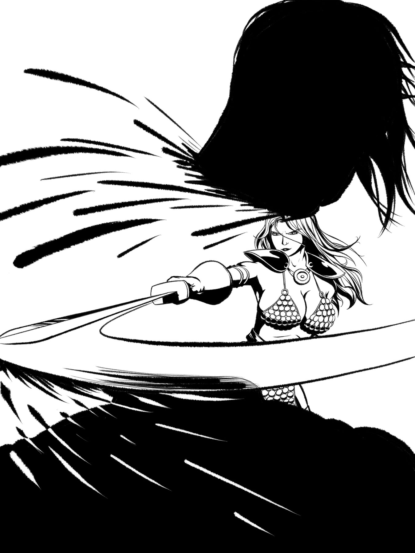
Red Sonja chopping some hapless mook’s head off – this is where things started to turn around, as all things do. My usually shakey confidence was shaken (not stirred) from my streak of failures, but I was (and am) generally happy with the way this turned out.
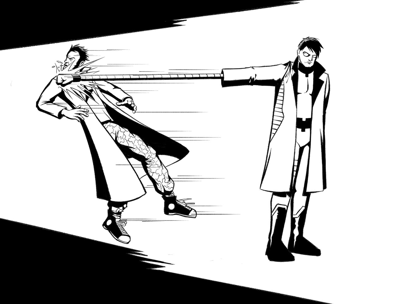
I love Nextwave. I suppose I could have gone Mr. Fantastic, Elongated Man, or Plastic Man (or something non-comic book related) for “stretch”, but Nextwave doesn’t get enough love, so Machine Man punching the Captain. Part of me thinks I should have done this at a more dynamic angle, but there is something very Wes Anderson, matter-of-fact about the composition that I like. Also:
I am but a single consumer, but: Hey, Marvel Studios. I’m rapidly losing interest. I skipped Ant-Man & the Wasp. I’m probably skipping Captain Marvel (and BTW, Captain Marvel is Billy Batson – not Mar-Vell, not Monica Rambeu 1, not Carol Danvers). Give me a Nextwave movie? I’m all in with a bag of chips. Mini-rant over.
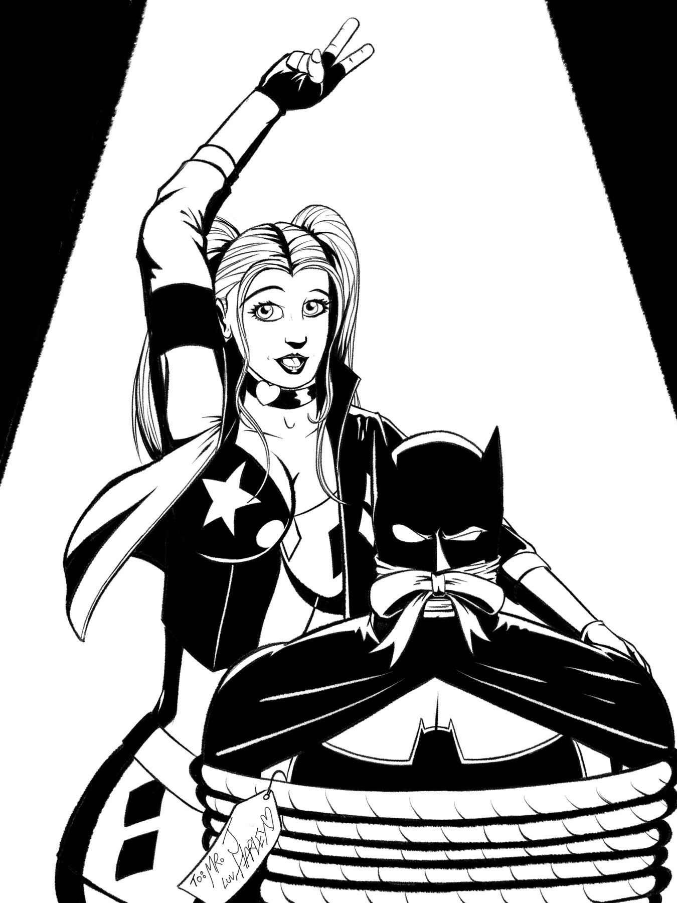
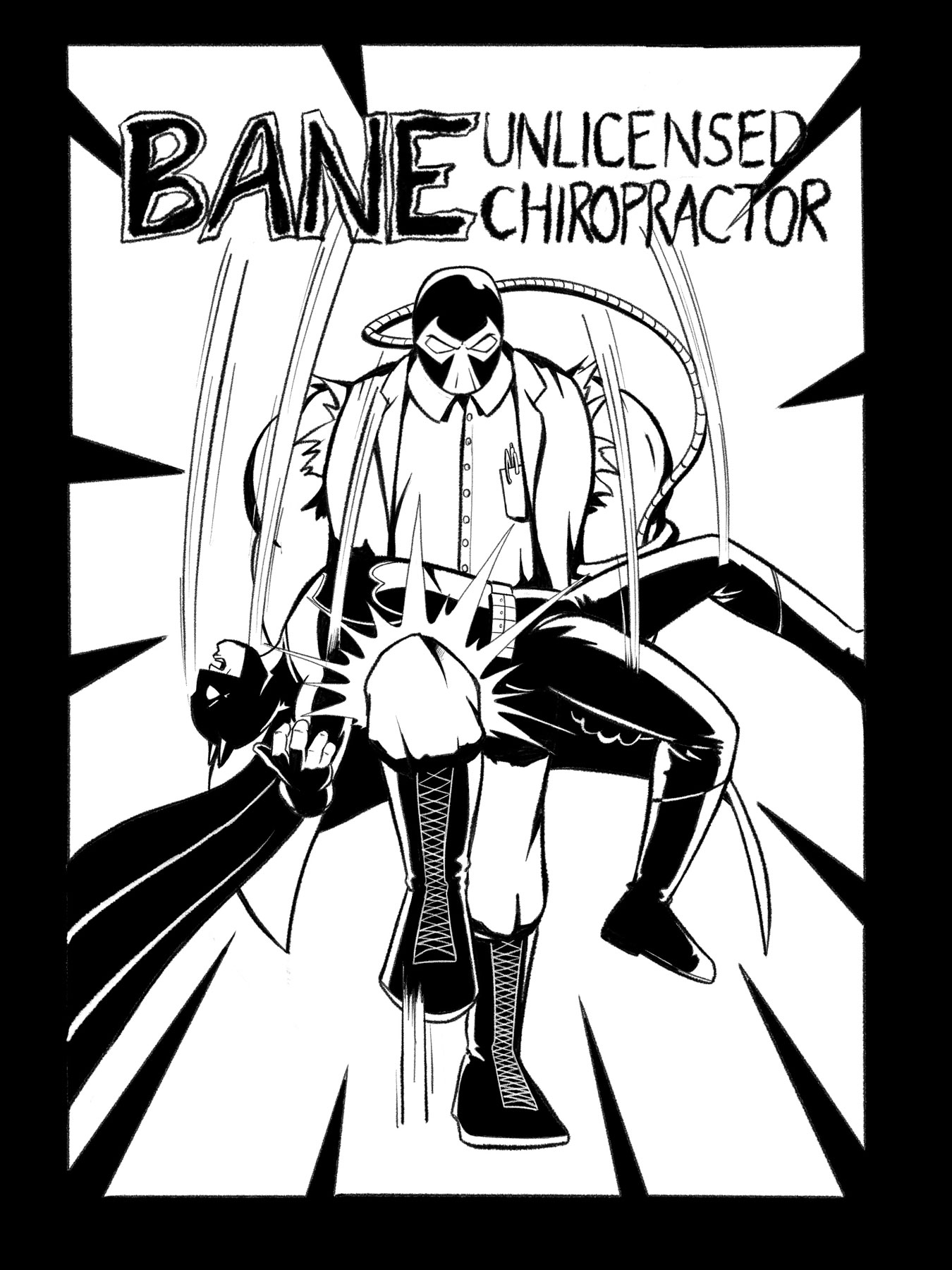
I have drawn more Batman related stuff in the last couple of weeks than I have since I was a kid. To be fair, Bats is fun to draw, and can have a nice, minimalist design. Originally, I was going to go with the Margot Robbie version of Harley, but ultimately went with Amanda Conner’s design, which works a lot easier in black and white.
Fourteen drawings down. One more to go.
1 Yes, complaining about the Captain Marvel naming debacle while simultaneously professing my love of Nextwave, Monica included, is weird, but… shut up. You’re not the boss of me.
Well, that certainly was a week of Inktober. Now, to the tune of “Everything Is Awesome” from The Lego Movie:
Everything Is Awful!
This week sucked. Really sucked. There is not a single drawing that I liked. Nothing turned out well. If you read the post about Inktober, week 2, I wrote about the idea that most artists only get about twenty-five percent of what’s in their head onto the canvas. This week, I think I’m batting one hundred, at best. Ugh.
Let’s make excuses!
Screw the prompt list! Yeah – what a piece of shit. That’s the ticket…. It’s certainly not my fault! It’s not like I was off my game, didn’t spend enough time working on each piece, couldn’t focus, and suffered from a minor case of artist’s block.
There is almost nothing about this that I think worked. The only good thing I can say here is I like the composition, but the draftsmanship and over all execution is lacking. Strike one.
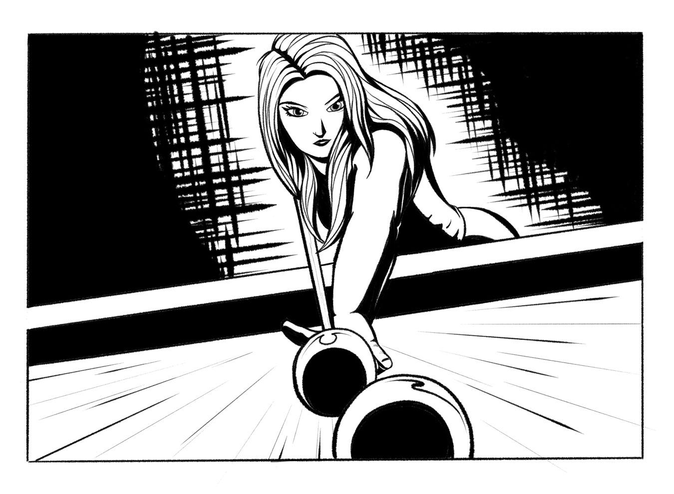
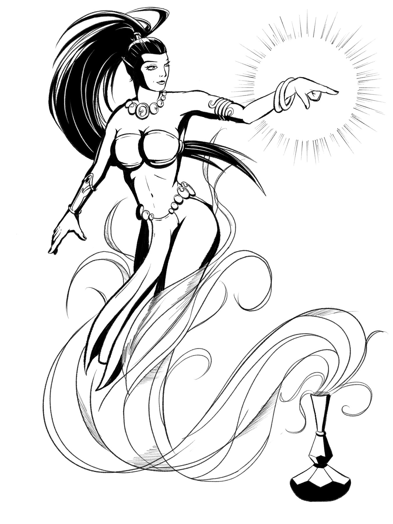
If I had to choose, I suppose this would be my favourite of the week, but favourite in the sense of “bullet to the back of the head, devoured by fire ants, or burned at the stake”: sure, bullet to the back of the head is the least painful, but you’re still dead. My main issues here are the face and movement. I really don’t like the face at all, and the figure seems to be stiff and posed – there’s no energy there at all. On the positive side, the actual design of the genie, the smoke and the bottle are okay, but doesn’t make up for the shortcomings. Strike two.
I don’t hate the idea of this one – in fact I was thought it was pretty clever. I do hate the way it is executed. The image just has too much unproductive white space. Bleh. Stike three.
You can’t win ‘em all. Frankly, this week was pretty discouraging, but self-improvement is always difficult, so here’s hoping I do better for the final drawings of Inktober. On to week four!